4° WEST
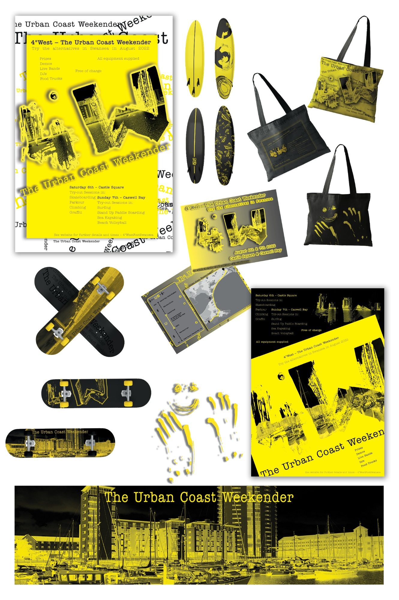
Uni brief - create branding for a fake festival at Swansea.
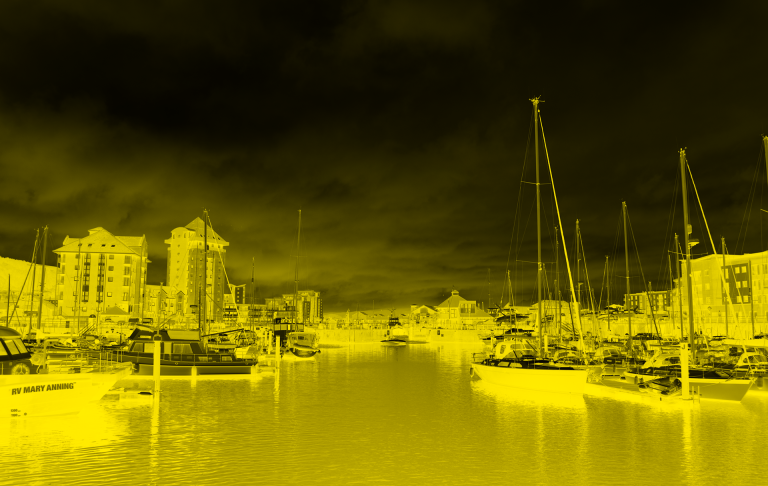
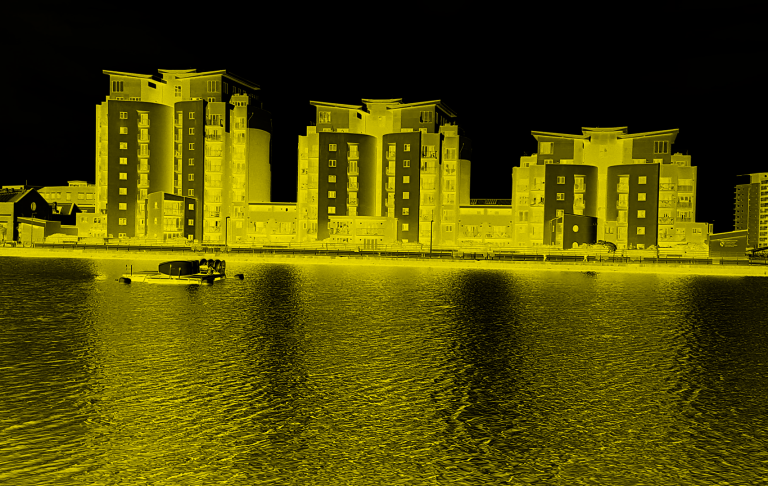
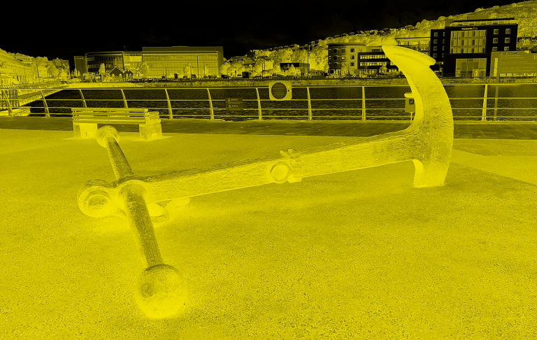
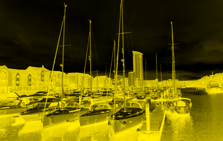
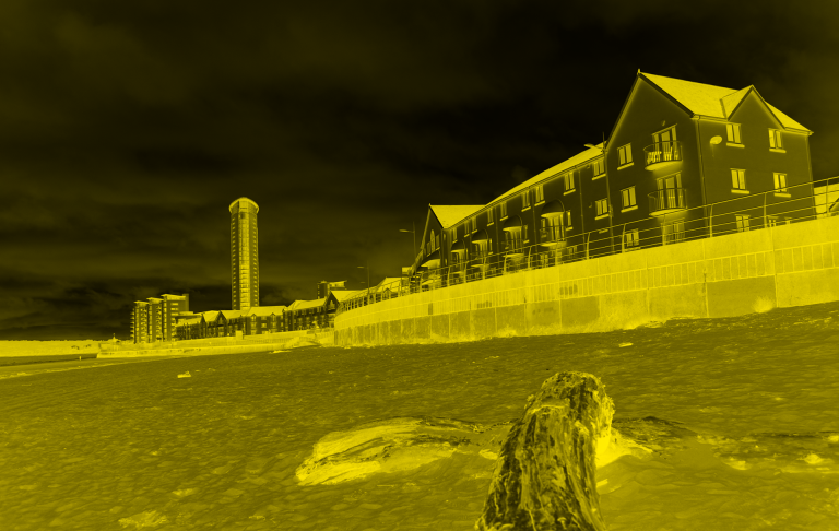
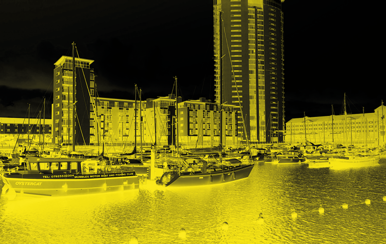
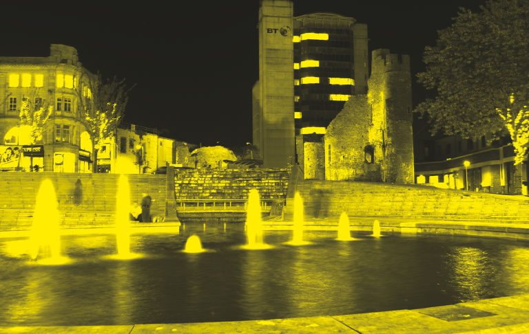
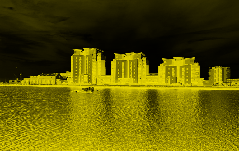
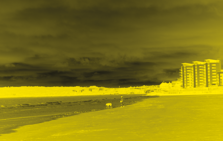
Creating branding is in my opinion one of the most interesting tasks for a graphic designer, which is why working on 4° WEST was very pleasant. The brief required the use of two colours, so I decided on two strongly contrasting ones. Deep black gave high contrast and clarity to the design, while neon yellow was designed to send a message to the viewer about the positive and joyful nature of the presented event. The combination of these two colours also resulted in high visibility and attracting the viewers attention. I used a duotone technique to develop the photos, which showed the beauty of Swansea. Working on this project gave me a lot of joy and satisfaction.
SWANSEA IN DUOTONE
© Copyright. All rights reserved.
We need your consent to load the translations
We use a third-party service to translate the website content that may collect data about your activity. Please review the details in the privacy policy and accept the service to view the translations.